Showing posts with label balanced design. Show all posts

Monday, July 22, 2013

Meaning Behind the Color: Turquoise

When selecting colors in design for a particular space we need to think in ways that reflect us as individuals as well as what the space is being used for. A quick example, red is used in dining rooms for a sense of appetite as well as in a bedroom for romance. This brings us to one of my favorite colors, turquoise! I did a little research to find out why I love this color so much and came up with some interesting information that I would like to share with you!  Turquoise represents open communication from and between the heart and the spoken word. It relates to the electronic age and the world of computers, and communication on a large scale. Also, it is the mid color between the extremes of red and violet, turquoise is the color of balance, for the emotions, thoughts and speech. Turquoise is also representing self-sufficiency and has the ability to tune into its own needs and find the way to success.  Turquoise also enhances the ability to focus and concentrate, assisting with clear thinking and decision-making, and the development of good organizational skills. Lastly one of my favorites,  it is calming yet invigorating, restoring depleted energies. Now the amount used in key, too much and it can create an emotional imbalance, too little and it can lead to secrecy, lack of direction in one's life.  Now that you know a little more about this great color, here are some spaces I think represent a healthy amount of turquoise! Enjoy!


If you have a project in mind but just don't know where to start, we can help! Contact us
Like what you see?

Make sure you never miss anything! Follow us!

Facebook     Website     Houzz      Pinterest     Twitter 

S Squared Design

Monday, March 26, 2012

Mix and Match Your Eclectic Style!

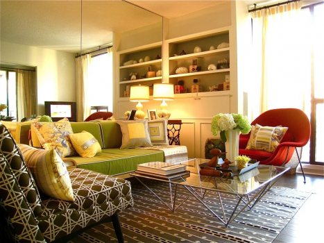
We've all seen that person's home with random pieces strewn about yet somehow existing in perfect design harmony. We've probably been a bit jealous, too. No need for envy- you can achieve this same stylish, stimulating look in your own home just by keeping things balanced. Be conscious of balancing solids with patterns, large patterns with small patterns, and bearing in mind how many colors are in each one. Here are a few good examples of how to design your home in a way that is 'serendipitous' rather than random. Enjoy!


 Even though the bright tufted sofa displays a lot of strong structure, giving the room some organic elements such as live plants makes this space more calm and relaxing.


  If you're going for a more neutral color pallet, try solid fabrics on the furniture and a bold yet neutral rug. This gives interest to the room along with artwork that provides a subtle splash of color.


 The solid bright teal sofa is complemented by bold patterned, toned-down pillows while the heavily textured shag rug lends itself as a neutral base to ground the entire room. 


 All natural linen is relaxing, comfortable, and nice, and all... but it can be livened up a bit! This soft red pattern offers gives some variety and character to the room, while the striped rug is very orderly, making a nice backdrop for the rest of the room.


 Green and red are complementary colors- that's why they're used together so much. However, you don't want your home to look like Christmas year-round: it's all about the different shades used. For example, a lighter, brighter green and a red with a hint of orange makes a perfect partnership.