When we purchased this original mid century home in Houston, my husband and I knew what an undertaking it
would be. Of course, I loved the layout and design of the house itself,
but it was in dire need of my personal TLC. Though
very happy with the progress, we know we have a bit further to go in
order to transform it into our ideal home. Much of the major work so far
has been on an intense kitchen renovation, with all other spaces in the
house getting a (less intense but still major)
facelift. So, without further ado, allow me to welcome you into our home!

Let's begin where most home tours begin: the living room. First, you'll
notice the neutral color palette and the blues and greens that welcome
you into a state of calm. To add height to the room, we used long
grommet curtains with an abstract geometric pattern,
which add some interest. The large window at the front of the house
allows streams of light to pour in and inundate our home with glowing
warmth (by the way, our dog absolutely loves to sun bathe here!).


In keeping with a mid century designed home, bringing outside elements
inside is crucial. The wooden furnishings in our living room are made of
re-purposed wood, smoothed and stained to perfection. Quality wood
furnishings are harder to come by these days, but
their durability, strength, and style will allow them to virtually last
forever! In case you're wondering, the side table (blocks) are suuuuper
heavy- looks are deceiving!

Just a few pieces I want to mention before moving on: take a quick look
at the glass-globe side table lamps, the varying accent pillows, low
profile couch, and the archetypal mid century modern chair. If you
haven't noticed, I love incorporating original art
work in the homes I work on to add an even more personal, and unique
touch. This piece in particular is actually my own creation! Can you
guess what it is?! It's an abstract representation of a magnified hop
bud (my husband and I are avid craft beer fans)!
Before we move into the kitchen here is a little before and after of this 1950's original kitchen!


Passing through the living room, we enter the heart of our home: the
kitchen. Because we love to cook and entertain so much, we had to extend
our kitchen three whole feet! We wanted a strategic, clean design with
maximum storage space. Our next phase in the
renovation is to gut the flooring in the entire house, which needless
to say will be a huge project. So, ignore the floor and take a look at
everything else!

Since storage is of utmost importance, we removed the bulkhead (also
known as a fur head) which is the useless gap between the tops of
cabinets and the ceiling that is only inhabitable by dust bunnies and
spiders. I don't understand why kitchens were so popularly
designed with bulkheads, but I made sure to promptly remove it from my
own. Now, these large cabinets flushed with the ceiling store everything
we have and will acquire in the future.

Next to the fridge (which was moved down for better accessed), we
installed a pullout pantry cabinet that runs the height of the kitchen.
Without this nifty pantry, this would have just been an empty little
nook. Because the shape, size, and design of kitchens
and large kitchen appliances don't always cooperate, it's important to
utilize whatever leftover space there may be, especially if you
want ample storage and a clean, streamlined design.

Though you see a lot of black in this chic kitchen, we were sure to
install LED lights under the cabinets to illuminate the counter work
space. The recessed can light above the sink replaced the old
fluorescent lights that yellow a room and damper the mood.
To bring in more light, our kitchen came equipped with a pleasant
little greenhouse window above the sink as well. The earthy, stacked
limestone tiled back splash softens the image of our edgy black and
stainless steel kitchen which helps to brighten up the
space, along with chrome accents scattered throughout the kitchen.

Now, let's shine the spotlight on our lovely composite sink, equipped
with a professional-grade faucet. No nobs, no hoses, no problem: we love
the simple, streamlined design of this heavy duty faucet! The sink
reaches the depths we need, all in stylish black
granite. This contrasts beautifully with the white quartz counters,
all illuminated by the chrome industrial style pendant hung from above.

Moving on to the guest room: a space where visitors can relax in style.
All furnishings are new, except the velveteen yellow tufted chair: it was an heirloom piece from my abuela! With mostly calming neutral colors, the yellow was incorporated in order to blend the chair in with the rest of the room.


Coincidentally, the yellow chair and neutral color palette also worked
perfectly with this beautiful Japanese fan, which was a gift to me from
my father from his travels. Coordinating colors and keeping consistency
is easy to achieve by employing various patterns
in throw pillows and other textiles.


This guest room has a perfectly placed window that lets in all the sun.
It's not even on the same side of the house as our front room, but
there's just as much sunlight pouring in! Again, we used the elegantly
elongated curtains here to shield some of the light,
and offer a gorgeous glow to the room.

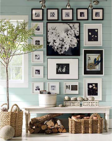
Before we reach our final destination of the tour, take a look at this
gray-scale hallway. This was such a fun project, and actually my
husband's suggestion! On the wall, we donned custom art from the two
places we've lived together: Texas and Philadelphia.

Last stop of the tour is our master bedroom. We wanted a space that was
truly ours, with bright colors calmed by gray textiles and wooden
furnishings. The series of paintings above the bed are my personal
creations, and combine all the colors featured in this
room: the green from the walls, sunny orange from the medium toned
wood, and gray from the bed spread.

Symmetry is a symbol of order, and we wanted our room to be a place
where we could find balance. The bed side tables and cylinder lamps are
smaller furnishings that complete this feeling of centrality. In
addition, the bed frame is fashioned in a way that showcases
its beautiful wood and smooth lines.

And with that, my home tour is concluded! I am incredibly thankful to
have a place where I can always find my inner peace, and where guests
can always feel welcomed and entertained: that's the beautiful balance
found in mixing a calming, neutral palette with
pops of color and intriguing designs.
We have quite a bit more to do in our home, so keep checking back to see our future projects!
If you have a project in mind but just don't know where to start, we can help! Contact us!
Like what you see?
Make sure you never miss anything! Follow us!
S Squared Design