Showing posts with label entryway. Show all posts

Saturday, April 18, 2020

Small Space? Big Style!

Bigger isn't always better. Typically it is having your space be utilized more. Some ideas I like to use with potential new clients are how they live and flow through their home. Where do you enter into your home? What do you leave at the entrance? Do your items have homes as well? Do you always drop something at the same place everyday? Maybe making that item feel it belongs there is important. 

These are just a few questions I like to ask when deciding how to start a design for a particular client. Maybe you don't know yet, but I'm here to help guide you through the design process as well as making your home feel less cluttered or that there is just "stuff" everywhere. Think vertical storage. Your walls are your friends and they will help you not collect things on every horizontal surface. 

If you use something daily or almost daily and want to out either on displace or need to access it, then it should have a proper home. Also, if there are items you take with you every time you leave the house those items too should have a home. I'm going to show you some of my little helpers in my home. 


I love blankets! I have like 5 in the living room alone but where should they go? Do they just sprawl all over the sofa or chairs? On the floor? Well I use one of them almost daily so it has a home. Somewhere I can easily get to it but also put it back as easily. As if we were kids learning to put our toys back when we are done playing with them. So these comfy blankets in my home have a basket that sits behind a chair so it appears clutter free on the sofa and chairs but I can grab a blanket anytime I need one or two. Sometimes it doesn't get folded and just in a ball on the other blankets but you cant see that behind the chair. 

One of my more important places in the home is where I enter from, the garage. I have hooks and a key holder, my purse, jacket or keys have no reason to come in the house any further than that so they have a home. I always know where those items are, not in a chair or on the kitchen counter, but in their home on the wall and out of the way of everything else. 


Aesthetics are important in design just like function is important too. Do you like coffee? You probably have a coffee maker that sits on your counter in the kitchen, but what about all the things that go with your coffee maker? Does the bag of coffee just sit on the counter next to it? looks like a piece of garbage waiting to be put in the trash? Well make it accessible and attractive. Get a couple decorative canisters for your coffee and sugar and whatever else you like to have in your coffee. Make it feel purposeful and if it is going to live there make it feel as if its part of the kitchen.
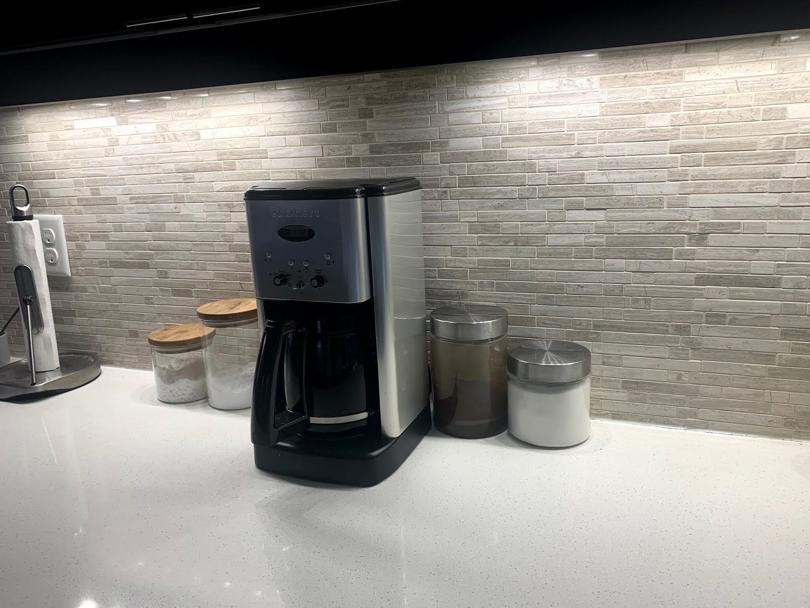


These are just a few ideas to make your home feel like things have a purpose and easily accessible. Do you have any good ideas for storage? Comment below!


If you have a project in mind but just don't know where to start, we can help! Contact us
Like what you see?


Make sure you never miss anything! Follow us!

Facebook     Website     Houzz      Pinterest
 
S Squared Design


Wednesday, April 20, 2016

Black, White and Red all over - Heights Modern Loft

This pair of empty nesters migrated south from Colorado to Texas and settled in the lovely historic Heights of Houston. With their human kids grown up and gone away (they still have two feline fur babies), they decided to downsize to a loft and upgrade to a more modern look. Lofts present some spacial challenges because they are small and relatively unstructured. In order to visually and functionally expand the space, design must be streamlined and free of clutter, with pieces strategically placed to add shape and form to the free flowing nature of many lofts. Ceilings that cap at fourteen feet definitely aid in opening up the area, and provide sufficient wall space for this couple's extensive art collection, but this tremendous downsize was still a challenge. See how we put their art on display, complemented by some old and new pieces of furniture, and gave their new home a modern, yet traditional and homey look. 


Concrete floors and exposed brick can feel a bit cold and industrial, especially paired with the contrasting color combo of red, black, and white. In order to bring in some unifying warmth, we featured several walnut pieces throughout that blended the red-brown of the brick with the black pieces that accessorize their home. 


Finding a place to sit in this living room is a nonissue. You can choose between the modern sofa bench, the pair of matching chairs, or the four red hot bar stools. To keep themselves and their fur babies happy, the couple needed to use comfy yet sturdy materials that they kitties could climb on and relax.


Speaking of seating, this modern sofa bench not only opens up the space by providing visual flow, but it also opens up the options of where to sit. The removable seat backs provide guests with endless possibilities to maximize (or even minimize!) their social interactions. 


This may seem like a simple coffee table, but it is so, SO smart-- especially for this space. Though a unique shape, the triangular with rounded corners is perfectly positioned between the living room's available seating. The base faces the sofa and the other two sides face the matching chairs that seated at nearly the same angle. Still nothing can get in the way of guests chatting and gliding from space to space.


Just beyond the sofa is the dining area. Again, the sofa allows the living and dining 'rooms' to be brought together perfectly so guests can feel free to glide from space to space. Here is a great example how to blend traditional with modern: a refinished antique dining table and chairs offsets the cool edge of the modern pieces.


Perfect for parties, we equipped the dining area with a full bar cabinet to the left, and a sideboard storage to the right that can easily serve a buffet. This loft was designed for entertaining! However, the large windows may make some nosy neighbors jealous they weren't invited... Maybe next time, neighbors!


Enough talk about the furniture- let's move on to the art and accessories! When space is limited, its crucial that displayed items are always kept organized in a way that looks deliberate. Board games, books, religious symbols, family photos, and vases can all coexist on these floating shelves in a visually appealing manner because they're grouped by color and complemented by other items to be equal in height.


You can bet that I needed a ladder to install the artwork here. Tall ceilings are lovely, elegant, and elongating especially when the walls are adorned with art. This couple had a fairly extensive collection of pieces dear to them that they wanted to put on display. Even though they downsized, there was plenty of wall space to accommodate. 


The paintings were continuous with the classic color scheme of red, black, and white featured in the furnishings, textiles, and other accessories. Fresh paintings subtly bring in more color to a space to make it overall more interesting. 

Just to brag about these ceilings one more time, we had enough height to add not just one but TWO chandeliers! In a loft, this is a big deal. One in the living space and one in the dining area bring in just enough light to the rest of the room. 

What a wonderful, fresh start for a new chapter in this couple's life together: a cool loft in a hip part of town, modern, and designed with entertaining in mind. They may be empty nesters, but their kids are sure to stop in for a visit (or maybe just a drink or two!). 


If you have a project in mind but just don't know where to start, we can help! Contact us
Like what you see?


Make sure you never miss anything! Follow us!

Facebook     Website     Houzz      Pinterest
 
S Squared Design

Wednesday, March 30, 2016

City Home Fit for a New Family!

This family with a newborn was in the market for a new home: their very first house, in fact! Since taking care of a brand new human is task enough, this family didn't want to totally start from scratch. With a few ideas in mind of what they wanted, we didn't need to gut the whole place- just update it a bit. The kitchen was the focal point of the design update, and the rest of the home flowed from there. We were even able to incorporate a lot of their existing furniture into this mid-century modern home. The family wanted to start living in their new home right away with an updated, modern style they always wanted. Take a look at how we achieved a budget-friendly home face lift!


Where light is sparse, it's imperative that you amplify the available light by using colors and sleek appliances that allow sunlight to dance around. This kitchen has a decent-sized window at the sink area as well as a glass double-door that lets enough light in. To keep the light growing, the back splash was finished with limestone tiles.


A great cost-saving measure is to keep your cabinetry and just change the doors and hardware. Here, we just replaced the plain cabinet doors with new textured glass doors. We painted the cabinets light gray to modernize it from the old oak that aged and darkened the kitchen before. The cabinets also got brand new brushed steel hardware to complete this new, modern look.


I know it's hard, but please stop staring at this gorgeous counter top. Look up! We installed a new pot rack that fits perfectly over the enormous island. No need to hide your pots, pans, spatulas, or ladles- put your tools on display! This makes for very easy access and increases your amount of storage.


One of the most fabulous upgrades to this kitchen is the sparkling quartz counter top! This shiny surface looks especially amazing on the brand-new extended peninsula. This is like going from being stranded on a desolate Florida Key isle to partying on the mainland peninsula: it's not a far or difficult trip, and it's definitely well worth it.


"Seeing red" doesn't always mean getting angry. Rather, it often just means getting energized! This couple wanted to use red as an accent color throughout their home, which otherwise maintains a soothing, calming palette. The red accent rugs in the kitchen and beneath the dining room set give warm, joyful pops of color that can be found throughout the house.

This beautiful dining room set was seamlessly transplanted into this upgraded mid-century modern home. Pro tip: chairs with larger, higher backs sometimes section off a space. To keep a 'flowing feeling,' set a bench at the side of the table adjacent to a walkway. That way, nothing 'visually blocks' a pathway to another room, which even makes the dining area even more inviting.


A home with kids doesn't have to be void of all 'adult' forms of entertainment. This four-tiered wine rack and minibar flushed against the wall is incredibly convenient when entertaining guests. Just out of reach of children, but perfectly placed for adults to open a bottle of wine, relax and easily spend time with their friends.


The living room features a gray scale color palette with pops of red in textiles. The art above the couch brings in a bit more color while keeping in line with the streamlined, modern look of the house. 


For mid-century modern houses, bringing outside elements inside the home is quintessential. For example, natural brick is generally associated with the facade of a house, but here it is featured in the family room.


The 'cozy' is strong with this one. A genuine fire place nestled inside a brick cladding makes you just want to cuddle up, doesn't it?! Here, photos of this loving family are displayed on the wooden mantle in sleek white frames.


This reading nook for two is modern yet cozy, flowing naturally from the living room. The shelving in this home library is perfect for putting books on display, or whatever else you'd like. I love the woven ottoman here! It is modern, playful, and functional (and fairly reminiscent of a giant hacky sack, which is probably the real reason I love it so much).


And last (though usually first) is the entry way! This first impression of your home is an important one. Organized and minimalist, the first few steps you take through the door are sure to give you a good idea of what else is in store. In this case, you're sure to find a blend of modernity and comfort in a neutral color scheme with pops of energizing color, fit for a new family's home.


If you have a project in mind but just don't know where to start, we can help! Contact us
Like what you see?


Make sure you never miss anything! Follow us!

Facebook     Website     Houzz      Pinterest
 
S Squared Design


Monday, January 14, 2013

Welcome the sun with filtered light!

When sunlight peaks through tree branches to create rays of filtered light, I can't help but feel surrounded by absolutely mystifying beauty. However, as we approach midwinter, we don't get to see the sun as often as we'd like or witness streams of sunlight. But don't worry- the sun will come out... next season! So, when spring finally comes, welcome the sun into your home with warm, filtered light. Now is the perfect time for implementing an inundation of flowing streams of light into your home. Enjoy!


 Angled ceiling skylights allow for bright, beautiful light beams to burst in and brighten a bedroom.


 These 'floating' stairs slice the sunlight, creating streams that pour light into an otherwise dismal stair well.


 Filtered light doesn't always have to be fragmented light- the sunlight enters this home through textured, opaque windows.


All about the angles- the thick windowpanes set at drastic angles offers a a unique edge to this modern, earthy dwelling


Like what you see?
Make sure you never miss anything! Follow us!
Facebook     Website     Houzz      Pinterest     Twitter 

Wednesday, October 31, 2012

Happy Halloween: Decor Edition!

It was the day of Halloween
And all through our home
People were wondering
If the holiday was known.

Spooky decorations were lacking,
and Halloween spirit was scant.
But we can't leave our home empty-
We can't! We just can't.

So what can we do that is quick, simple, and fun?
Let's consult S-Squared design; they're second to none!
We don't want something cheesy,
But we'd appreciate something easy.

Help us create a space (spooky and scary, or festive and cute)
That can return next year without giving it the boot.
Happy Halloween, may your fun be plenty!
Happy Halloween- our thanks are many!
-Andy and Mandy (the Rhymers!)


Not all of us may be gifted with poetry (or have the patience to hash out some rhymes) but I assure you- if you have the desire to be creative, time is no issue in creating a festive theme for your home. My philosophy is that the amount of effort spent decorating a space should be directly proportional to the amount of time that space will stay decorated. For instance, if you are a Halloween fanatic and celebrate the holiday for the full month of October rather than just on the last day, then you probably put a lot of thought and effort to creating a Halloween wonderland. If you could only find clearance-priced candy when you last-minute-shopped for Halloween treats to hand out, then you probably just observe the five hour period of trick-or-treaters. So, to those of you who relate more with the person in the latter description, here are a few simple ways to turn your house from your daily scene to Halloween. Enjoy!

You know that uneasy feeling you get when passing by an abandoned building? You can create this same creepy feeling in your home just by overturning a few pieces of sturdy furniture in your entryway or patio for trick-or-treaters to see. All you need is furniture you have in your home, or old furniture if you prefer, and some store-bought cobwebs that are cheap and easy to display. Mix this display with some dim lights or candles and you are sure to instill fear in every trespasser!


 Not so keen on Halloween? Celebrate autumn! Mother Nature's colors are changing and she has a lot to offer! Leaves fall from their newly-barren limbs and turn from green to little fiery flakes, offering the perfect materials for your quick fall craft project. Out of twigs, leaves, pine cones, and whatever else you may find just outside your home, you can create centerpieces, wreaths, or small accents to give your home a cozy 'fall feel.'


 Perhaps you would rather appeal to the fun and festive side of Halloween rather than the gloom-and-doom side. Years ago, I constructed a five foot black widow spider solely out of wire and glue that is still sturdy enough to suspend from the ceiling in the entryway. Though large, the spider is pretty 'cute,' especially when complimented with small Halloween accents like black vases, carved pumpkins, or stuffed black cats and ghosts.  


HAPPY HALLOWEEN EVERYONE!

Thursday, April 19, 2012

¡Bienvenido! Willkommen! ようこそ! Welcome!

However your home says "Welcome!" make sure it says a little bit about you, too! The entry way gives your home's first impression: make it a good one! Make your foyer fashionable, functional, and totally unforgettable by implementing these design ideas- you (or your guests!) will feel right at home as soon as you walk in. Enjoy!


 This entry way says 'Welkom thuis!'- it's very European and modern. Without wasting any space, this design is highly efficient and useful, yet incredibly sleek and smooth. I love the wood texture mixed with the clean, bright white!

 Bam! This entry has a life of its own. Wild zebra rug, chunky console table paired with a white bold mirror on a grey wall sure makes a statement. Mixing straight lines with organic forms is a great way to give more interest to the space. 

 
 Clearly you have exquisite taste! The clear chair, mirrored table, and glass decor let light travel through and bounce off surfaces to visually maximize space, while the bursts of color maximize style!

  Welcome to a world of wonder! This entry way mixes natural elements with classic and vintage designs to create a wonderful walk-in. 

 
Say 'Honey, I'm home!' without dropping a thing. This metal apparatus is convenient, classy, and keeps you organized! You will never have to hear your honey ask 'Where are my keys?' again.

 
 Not sure where to put your stuff when you walk in? Hang on- there's a place for that! These hanging-storage duos are on double-duty! Notice the color accents inside the bins? Love it! Perfect for a back door, utility room entry.


Hope you guys enjoyed today's inspiration! Fell free to leave a comment.  Tell us what you liked and if you are in need of inspiration and its not here.....we will find you some!
 
Like what you see?
Make sure you never miss anything! Follow us!
Facebook     Website     Houzz      Pinterest     Twitter 

Sunday, March 11, 2012

Don't waste that space!

A frequently neglected area of a home is the hallway. A typical hallway or staircase can encompass a good portion of a home’s livable space and often aren’t used to their full potential. Hallways or corridors don’t have to be devoid of emotion; a simple, practical approach can add an extra personal touch.

 A bolder approach, should the above example bore you, is to create a more eclectic look by using
mixed and matched frames. The matching lamp and walls create a more put together feel, while the
dominating horizontal white and black lines maintain some structure.


Choosing an eye catching color to apply to the walls brings a unique feeling to the space. A bold color
requires minimal additions, which help this bright chartreuse be the center of attention.
 If you have the option I love the idea of being a little more creative and making a lasting impression.
You can create a huge effect with either paint or by applying a custom or ready made piece of vinyl.
LTLprints.com has a huge selection to choose from and you can even create your own. Whether you
choose paint or a print, both are easy to change if you get bored.


 A more traditional approach is to apply photography. I like the idea, however I like to apply a personal touch that makes the space pop. The example above uses identical frames, with a simple white matte, centered at eye level. The clean lines and organized appearance allows a larger number of pictures to be displayed 
without being overwhelming.


Like what you see?
Make sure you never miss anything! Follow us!
Facebook     Website     Houzz      Pinterest     Twitter