Showing posts with label minimalist. Show all posts

Thursday, May 7, 2020

Working from Home: The New Home Office Design

There is no telling how these last few months during this pandemic will change how we work and more importantly where we work from. With the lovely invention of the internet we professionals have more flexibility to work from different places. Could be from your sofa one day, your patio on a nice day or maybe you are super focused and working from your dedicated home office. I have mostly worked from home for the past decade creating beautiful designs for my clients and enhancing their everyday life with personalized spaces that reflect who they are. In any space you spend a lot of time in it's important to have it feel good and function well for you.


Some of us will return or our company office, others might have some flexible office hours and some of us may be entirely working remotely. Which means you now have a new space to design for working there everyday! Things to consider in a home office, work surface, comfortable seating, storage (if needed), and of course how it makes you feel when you are in there. Does it make you happy and/or productive?

A tiny office still gets a couch - it can work!

Clutter free space is a good place to start. Think about what items you need to work at full capacity. Do you need just a laptop or do you need a printer and storage space for documents? Some people need a multi screen set up to view different documents they are references or can be multi tasking. Others like one screen to help them focus with little distraction. When making a list of what you "need" in your office to make it work for you, make sure you don't overlook smaller items that might need an accessible home, like pens or a note pad to quickly write down something from the phone call you were on.

Crafted from solid mango wood and lofted on airy steel legs, our Rustic Storage Modular Desk comes with two attached box files—store letter and legal files in the deep drawers or stash away books, magazines and other desk accessories.


A comfortable chair is key as well. You will most likely be sitting for hours so it being a good fit for your body and how you sit are important. Remember getting up every hour or so and walk around is healthy for you. Walk away for a few minutes then come back with a fresh mind can make a world of difference. I have an upholstered wide chair with arms that I can sit on a foot sometimes but I can also sit like a professional getting down to business.

window/skylight and desk shapes


Depending on what kind of work you do you may need some space for short and long term storage. Maybe you are mostly paperless and this might not apply as much to you but maybe you work in construction and have a stack of construction documents. Look at what you need other than a stack of papers on your desk, because no one likes that!


Justine Hugh Jones Design Study Est Magazine

If you become overwhelmed with what seems like a daunting project, we are here to help. Helping you space plan your space, get all the function you need to be productive and feel happy in a space that reflects you are your style!


If you have a project in mind but just don't know where to start, we can help! Contact us
Like what you see?


Make sure you never miss anything! Follow us!

Facebook     Website     Houzz      Pinterest
 
S Squared Design


Saturday, April 18, 2020

Small Space? Big Style!

Bigger isn't always better. Typically it is having your space be utilized more. Some ideas I like to use with potential new clients are how they live and flow through their home. Where do you enter into your home? What do you leave at the entrance? Do your items have homes as well? Do you always drop something at the same place everyday? Maybe making that item feel it belongs there is important. 

These are just a few questions I like to ask when deciding how to start a design for a particular client. Maybe you don't know yet, but I'm here to help guide you through the design process as well as making your home feel less cluttered or that there is just "stuff" everywhere. Think vertical storage. Your walls are your friends and they will help you not collect things on every horizontal surface. 

If you use something daily or almost daily and want to out either on displace or need to access it, then it should have a proper home. Also, if there are items you take with you every time you leave the house those items too should have a home. I'm going to show you some of my little helpers in my home. 


I love blankets! I have like 5 in the living room alone but where should they go? Do they just sprawl all over the sofa or chairs? On the floor? Well I use one of them almost daily so it has a home. Somewhere I can easily get to it but also put it back as easily. As if we were kids learning to put our toys back when we are done playing with them. So these comfy blankets in my home have a basket that sits behind a chair so it appears clutter free on the sofa and chairs but I can grab a blanket anytime I need one or two. Sometimes it doesn't get folded and just in a ball on the other blankets but you cant see that behind the chair. 

One of my more important places in the home is where I enter from, the garage. I have hooks and a key holder, my purse, jacket or keys have no reason to come in the house any further than that so they have a home. I always know where those items are, not in a chair or on the kitchen counter, but in their home on the wall and out of the way of everything else. 


Aesthetics are important in design just like function is important too. Do you like coffee? You probably have a coffee maker that sits on your counter in the kitchen, but what about all the things that go with your coffee maker? Does the bag of coffee just sit on the counter next to it? looks like a piece of garbage waiting to be put in the trash? Well make it accessible and attractive. Get a couple decorative canisters for your coffee and sugar and whatever else you like to have in your coffee. Make it feel purposeful and if it is going to live there make it feel as if its part of the kitchen.


These are just a few ideas to make your home feel like things have a purpose and easily accessible. Do you have any good ideas for storage? Comment below!


If you have a project in mind but just don't know where to start, we can help! Contact us
Like what you see?


Make sure you never miss anything! Follow us!

Facebook     Website     Houzz      Pinterest
 
S Squared Design


Monday, October 14, 2013

A Designers Home: Designing for Our New Nest

My husband and I have been renting for the last few years and this year finally were ready to buy our first home. Hooray! Now this is a very exciting time in our lives, but home ownership comes with different priorities than a rental. Since I am an Interior Designer my focus for the house is, well, a showcase of my work. A place for me to experiment and do "crazy" things throughout the home and make it reflect us and our lifestyle. We are young, outgoing, social and are up for trying new things! So our house should and is going to reflect that. My husband, well he is an engineer, so you can see how we balance each others ideas when deciding what order to do things in the house are. We are both problem solvers and we love that. So solving our homes problems is what we are going to do.  

Now to give you a little background on the home, its a one-story brick, built in 1958, three bedroom, 1 &1/2 bath, two-car garage. Nice little yard for our dog and our future herb garden(already planted some spinach and kale). Now think of the 1950's, its one of my favorite as far as architecture, our house is still mostly traditional looking from the street, but we have lots of plans to make it more modern and well reflect is without changing the architecture too much. I want everything we do to be a surprise, so when we complete a project that is when I will show you before and afters, for now use your imagination! :) Starting from the curb, brick front is always a great place to start and ours is a mix of orange and light grey brick, almost like a white wash in some areas, currently the garage doors, shutters and siding are a light blue, typical of the 50's for sure. That will be change when we get new garage doors, we are looking at doing a fresh light/medium grey (Sherwin Williams - 7044 Amazing Gray) and doing the door and window trim a fresh white (Sherwin Williams - 7004 Snowbound). These color changes will make a huge difference in the homes curb appeal. To finish off the front we will do our new 50's inspired front door in bold turquoise (Sherwin Williams - 6951 Cote D' Azur), large stainless steel house numbers, a new vintage modern entry light and we currently have round columns, we will convert these to square ones finished in white. 

 Something kind of like this!

Now that you are excited to come inside, let's talk about our plans for the first room you see, the living room. The first we are going to do its paint the walls (Sherwin Williams - 6471 Hazel) This color is in our drapes we selected from IKEA(yes we have to keep costs low in some areas in order to be able to splurge in others) I loved the pattern so that's why we went with them. Now another surface that has to be addressed in the flooring, we are going to do solid tiger striped bamboo throughout the entire home minus the bathrooms. Now the floors and walls have been addressed in the living room, the layout is ideal for tv watching and leaves a good flow path to the dining and kitchen areas, as well as the hall to the bedrooms. There is a small coat closet that is preventing a more open floor plan and we plan to take that out so we have a 8' opening between the dining and living areas, this will make it ideal for entertaining and overall open feeling throughout the house. After that, furniture and accessories will come in, our style is what i would call, vintage modern rustic industrial. A mouthful I know, but we love natural woods, industrial pipe, clean lines, with a touch of history(vintage). Moving on to the dining area, oh the 50's full of colors we may not select today, but currently the floor is a medallion, gold colored vinyl tile, not our favorite but that will be replaced with the bamboo flooring. Now sometime between the 50's and now the dining area got some wood paneling installed(which is currently painted yellow). Sorry for those of you who love it but it has got to go! It will be replaced by new drywall and fresh paint (most likely Sherwin Williams - 7065 Argos), we have turquoise chevron drapery panels that will go on the sliding doors out to the patio. And a bold gray and turquoise area rug will sit under our new dining table, which we are going to make out of reclaimed wood with a metal and wood double pedestal base. As far chairs, we will be using clear acrylic chairs so the beauty of the table is seen and not blocked by chairs. We have a 50's walnut sideboard that will act as our bar area for entertaining and wall shelves above for bottles and glasses. A new chandelier will go above the table, we love urban chandy and previously had a chandelier made by them, but we moved and are in need of a different size.  Moving into the kitchen, for those of you who know me, I take pride in making a kitchen as efficient as possible, no need for a giant kitchen, you just need the right layout and fittings for your cabinets. A black wood grain cabinet finish will be used and fitted with modern chrome handles, the counter will be a light gray Cesar stone(similar to silestone but more monochromatic colors.  As for a sink, we cook A LOT, so the kitchen is very important, but back the sink, now most people would go with a stainless steel sink but we wanted to do a black granite composite single basin sink. This allows us to clean big pots and we have had double basin sinks and they don't seem to work for us. For the faucet, we are going to use a professional kitchen faucet, this will make it easy to clean, wash, and look great while doing it. 

Like this!

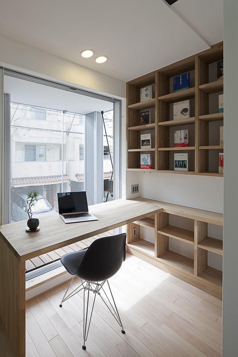
Moving on to the private spaces, the hall bath is pretty in pink tiles right now but we will soon change that to some grey, more modern tiles with stark white and black accents. A 5' vanity will be great with a large mirrored medicine cabinet over the sink with plenty of storage. new lighting and a new tile tub surround all the way to the ceiling. The other bathroom needs a little more attention, currently it is a half bath attached to the master bedroom. Back in the 50's this was common for some reason, but lucky for us we have space in the closet to make another full bathroom. Yay! We will have a frame-less shower with the flooring the same throughout, a trough sink so two people can get ready at the same time. We are going to do hex floor tiles(a little vintage for the new bath) and simple subway tiles. A few shower cubbies done in an accent tile and a rain shower-head. Going to be a great open bathroom perfect for two people to use. Since the master bathroom is taking the closet, we will be adding a wall-to-wall floor to ceiling built-in wardrobe on one wall of the room, with all the interior fittings we need to make it as efficient as possible. The guest bedroom will be crisp, clean and inviting for our guests, that will be a big surprise for everyone! Now I have to have a home office, this is my creative space. A place were I ponder ideas for my upcoming projects and dream of new innovative ways to design. So this too will be a creative, unique surprise, and it will definitely be awesome!

So those are the plans! There will be more to come as we complete these projects! Stay tuned and I hope you are inspired to work on finishing your home! 


If you have a project in mind but just don't know where to start, we can help! Contact us
Like what you see?

Make sure you never miss anything! Follow us!

Facebook     Website     Houzz      Pinterest     Twitter 

S Squared Design

Monday, September 30, 2013

Project: A Place Fit for a Queen

I recently finished a project where my client wanted to use her favorite color, purple. Being a designer can have it's challenges, such as designing with a new color or creating an overall look or style that you have yet to do before. Designing high rise lofts has become a favorite for me and every time I get the chance to design them I have a blast! With my most recent project that was the case and we were going to design with a color that we don't use very often. For this project, my client a cheerful, easy-going lady who wanted her home to be show stopping. Incorporating her love for purple, making each space have a wow factor was important. She wanted something unique, functional and stunning. Here are some photos of the finished spaces and I want to share them with you! Enjoy!


 We wanted the bedroom to have a little femininity to it but nothing over the top. A soft ivory linen, tufted headboard was a great place to start and to make the bed more of a focal point we used a warm grey paint as the accent wall. This made for a nice backdrop for the white and purple painting. 


 A chandelier is always a must for a queen's bedroom, with the 10' ceilings this allowed us to use a decent size chandelier without being too large for the space.


 When the sun goes down there is light to be need at night. We used small mercury glass lamps on the bedside chests for soft lighting in the bedroom. The chests were a must for this smaller room to give our client enough storage and to keep her organized.


 While we kept  most of the room neutral, we wanted to bedding to be the pop of color we need. Solid in color but heavy in texture gives the bed that inviting feel while also mimicking the tufted headboard.


 Crisp and clean lines make this room feel relaxing even with the bold purple bedding.


 Client requested a good amount of pillows and so that is what we gave her, a hotel looking bed with plenty of pillows.


 The views in this place are amazing so we opted for no window treatments to allow the views to be a focus. Minimal furniture in this space to allow traffic to flow from room to room. We used the same grey paint from the bedroom in the living room and it works perfectly with the charcoal sofa.


We did a personal photo wall in the entry. I love giving clients something that makes there place reflect them even more. We mounted large black and white photos on gold paper and framed in a simple, clean black frames. Gold was an accent we use a little in each space but since the hallway need a little more interest, we decided to use in as the backdrop for the photos.

If you have a project in mind but just don't know where to start, we can help! Contact us
Like what you see?

Make sure you never miss anything! Follow us!

Facebook     Website     Houzz      Pinterest     Twitter 

S Squared Design

Tuesday, May 21, 2013

Design Tip: Adding Accent Colors to a Neutral Palette

Color is a difficult thing for many people when designing a space. They know what they like just maybe not the right shade or don't know how much to use.  It is your home, so do what makes you happy but for those of you who don't know exactly how to pull together a space with what makes you happy, here are some pointers! Enjoy!


 Let there be one dominate accent color. Lots of blue on the wall and a single object in red.


 Don't want too much color? Try a neutral palette with a few pieces in a bright colors. Also this makes it easy to change your color scheme when you feel the need.


Bright white is always a great choice when adding really bold colors in a room. It lets the accents speak up. 


 Want to use more than two colors? Of course you can!  Make sure they have enough contrast and are given a neutral background.


Bold wallpaper is always a great way to introduce a color. Make sure to leave the rest of the room neutral enough so the wallpaper is the focus and nothing will compete with it.


If you have a project in mind but just don't know where to start, we can help! Contact us
Like what you see?

Make sure you never miss anything! Follow us!

Facebook     Website     Houzz      Pinterest     Twitter  

S Squared Design


Monday, April 15, 2013

The Modern Bedroom

Ah....the bedroom. The place where you retire at night, read in bed, snuggle with your partner and of course sleep. Bedrooms should be a relaxing and clutter-free space, so when you wake up to start your day you feel refreshed and happy! Being an interior designer, I sometimes get asked to design a bedroom or two. This is always fun for me! Bedrooms usually consist of lots of textiles and soft materials which can make your room have that cozy, curl up feeling. A client of mine had seen a previous bedroom I designed on my website and was so happy to find a designer that didn't just add "stuff" to a room to fill voids. Empty space can be beautiful and should be in every room. It gives your eyes a resting place and can make a space look larger than it really is. Below are a few bedrooms I designed with a somewhat minimalist approach. Enjoy!


Hope you guys enjoyed today's inspiration! Fell free to leave a comment.  Tell us what you liked and if you are in need of inspiration and its not here.....we will find you some!
 
Like what you see?
Make sure you never miss anything! Follow us!
Facebook     Website     Houzz      Pinterest     Twitter 

Monday, April 8, 2013

Clean it Up: Bathroom Edition

A Bathroom is usually where you start your morning once you get the energy to roll out of your comfy bed. Bathrooms are especially important because it gets used everyday. Functionality in this space is crucial and they best way to get the most of our your bathroom is to evaluate your routine. How many people are using it, what times and the order of tasks you go through each morning. These particular bathrooms below are all crisp and clean in white. This can be very relaxing in the morning and keep you calm, rather than stressed.  Some may think an all white bathroom is boring but with the right textures and some lacquer finishes you can create interest without having to introduce any other colors! Let the form of the bathroom fixtures make create the interest. Take a look and let us know what you think! Enjoy! 


Tiling the wall all the way to the ceiling is a great way to give your bathroom more height and with a hot shower your walls won't be sweating they moisture will just run right off. 


Windows at the ceiling line brings in lots of light without sacrificing privacy. Even in the shower you can have a window! 


White Shelves and white accessories make this white bathroom even whiter! Little hints of stainless steel break up the all white bathroom.


The flooring is amazing! Small flat stones give a much needed texture and natural pattern for a white bathroom. 


 Reflective surfaces like mirrors and glass let the light bounce around the space, making it appear as if there is more light than there really is.


Like what you see?
Make sure you never miss anything! Follow us!
Facebook     Website     Houzz      Pinterest     Twitter  
S Squared Design

Tuesday, July 31, 2012

This is more than just a sofa!

Sofas don't have to be big, bulky, boring objects, let them speak for their self! These are a few sofas I found to be pretty interesting and different. People tend to go for only comfort when purchasing a new sofa, but even though these might not be loose cushions it can still be a comfortable sofa to spend an evening cuddled up watching a movie or watching the football game on the edge of your seat. Which ever you chose remember next time to give your sofa a chance to be interesting and loved by all who get to enjoy it. Enjoy! 


 Perfect spot for a date night at home!


 You can rest your head or your feet whichever way you want!

 Want a chase on your sofa but don't have the room for it? This is perfect for a space challenged room!


Like what you see?
Make sure you never miss anything! Follow us!
Facebook     Website     Houzz      Pinterest     Twitter